
The Medical Pipeline
Adobe Photoshop
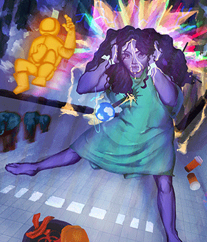
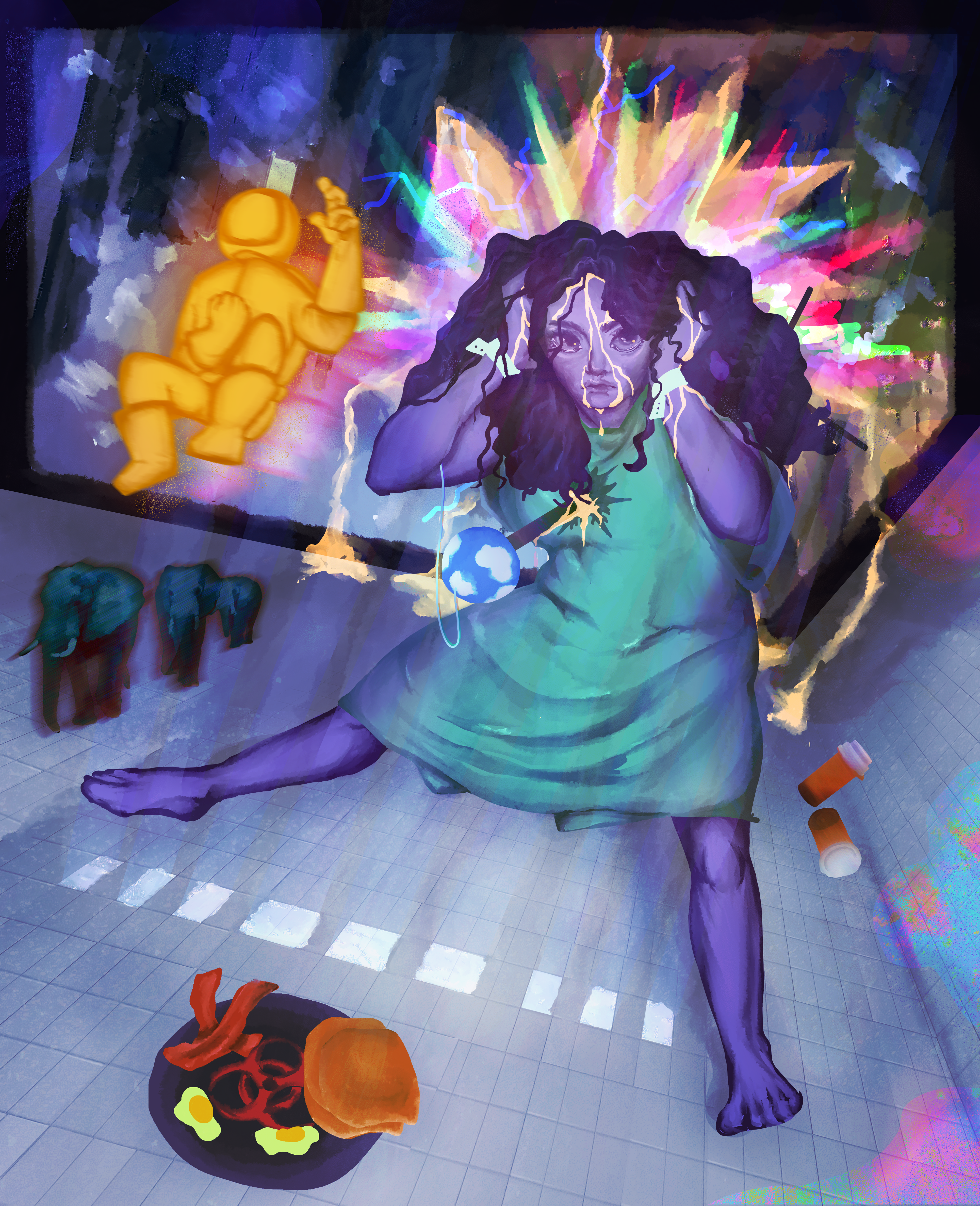
A surrealism project that allowed me to both further develop my style and understanding of art and composition. I implemented the aesthetic for both the unconscious and conscious representation through color theory and design choices. This aided to develop purposeful image combinations in order to tell a story.
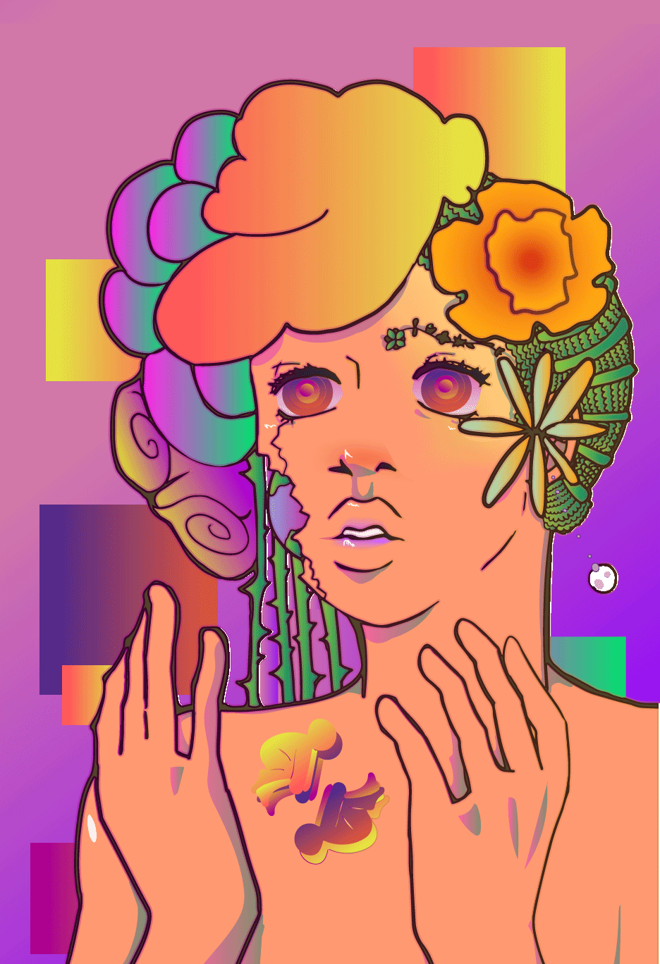
And We wept
Adobe Photoshop Adobe Illustrator
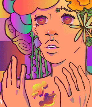
With the help of Photoshop, I was able to bring the line art of this image into Illustrator and image trace the art to create a vector image. Gradients through color theory and blending modes where created to develop lively colors for a solemn message.
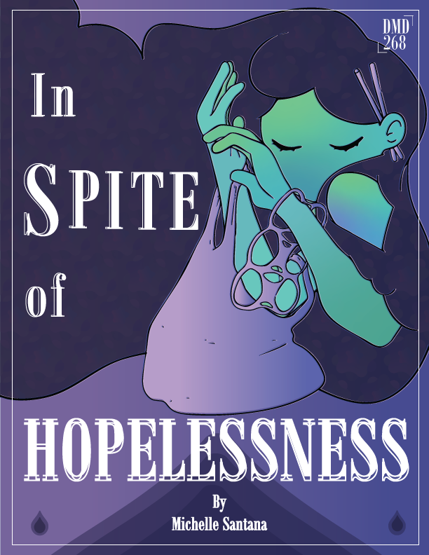
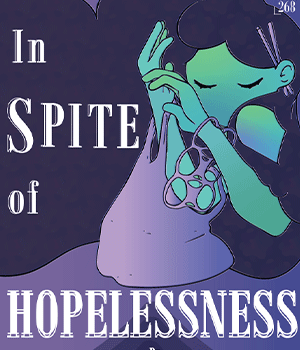
In Spite of Hopelessness
Adobe Photoshop Adobe Illustrator
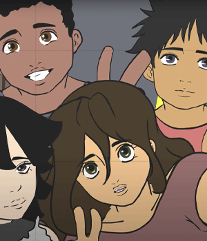
With the help of Photoshop, I was able to bring the line art of this image into Illustrator and image trace the art to create a vector image. Gradients through color theory and blending modes where created to develop lively colors for a solemn message.
Click for PDF
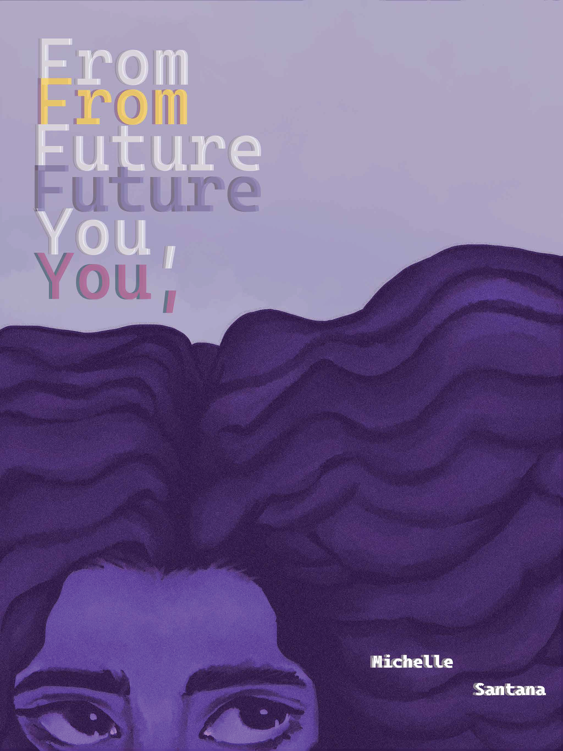
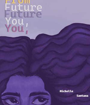
From Future You
Adobe Photoshop Adobe InDesign
A story book that utilizes both my art style and photography to create a haze like affect that purposely blend together. Using the smudge tool in Photoshop, I was able to create a paint style affect to mimic the style of my own art for smoother transition between the two. Understanding of color combinations and blending modes helped bring the art composition together.
Click for PDF
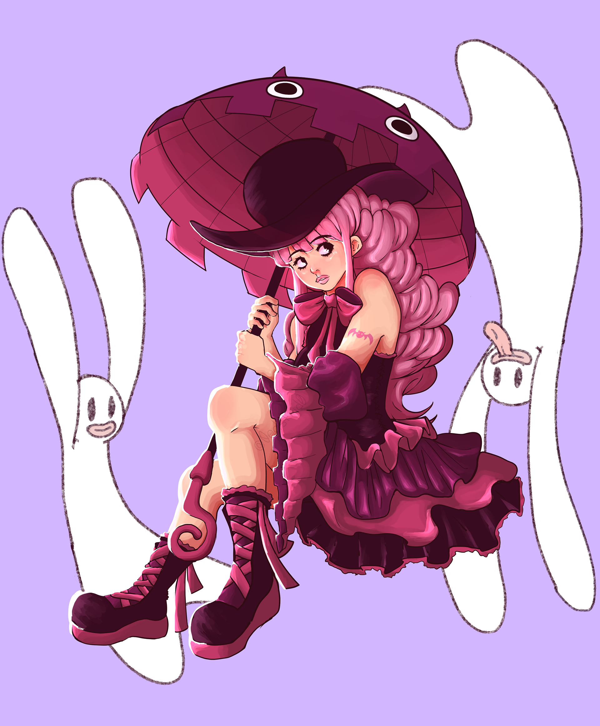
Perona - Fan Illustration
Clip Studio Pro
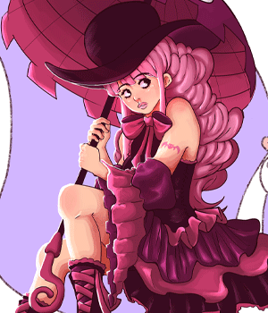
A personal drawing project that I was keen on finishing. Perona is a character from an existing show that I decided to try and recreate in my own style.
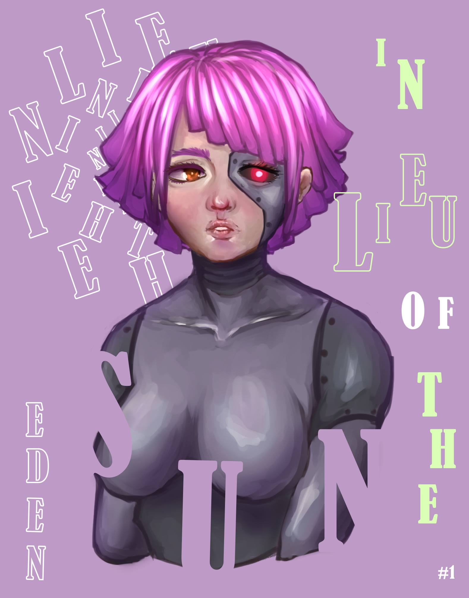
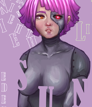
Cyborg Girl
Clip Studio Pro
Developed for a full project in mind. Illustration for a personal project.
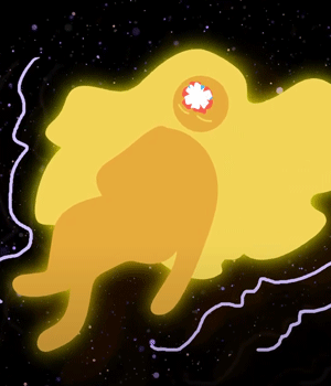
The Sleeping Astronaut
Adobe Illustrator Adobe After Effects
This project required us to create something that representing us in some way. For me, that meant I had to create something in terms of outer space and the mind. Using Adobe After Effects, I imported illustrator files and successfully animated a bumper that represents me.
Art on the Mart
Adobe Illustrator Adobe After Effects
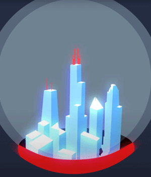
Animation for the Art on the Mart building that required the creation of a video that demostrated our own representation of Chicago. As a class, we decided on theme of the changing seasons - including our own individualize ideas. I decided to utilize the architecture of the buildings I found facinating - incoporating them into the video in a way that also utilize the design of the CTA pamplets.
In Lieu of the Sun
Adobe Animate
In Lieu of the Sun was a story idea that I had originally planned out to be a webcomic. I had just about four to three weeks to story board, voice act, and animate a sequence that ranged from one minute to one minute and thirty seconds. I thought it would be a fun challenge to attempt a trailer-like animation for this final, so that is what I did.
The character design process was easy – the majority of the characters had been previously developed from various stories. For me, a simple narrative for each would suffice since I had to think realistically about what could be done within a specific time frame. As much as I would have loved to be thorough in terms of details with character outfits and environments, of course I had to jump immediately into the storyboarding,
Storyboarding feels like it comes quite naturally to me. When I think about my animations, I see them as a film in my head before I draw them on paper. I think about camera position, timing, and small details within a scene that could bring the picture to life. With the time I had although, I found myself flowing towards the end of my storyboard. It felt like the story that I wanted to tell at that moment. I could hear the voices, emotions, and see the transition of each scene within my mind's eye.
The animation was the tedious, yet the most fulfilling part of the entire process. Understanding timing, why something worked while something else didn’t, and understanding how my workflow affected my progress were all intriguing to me. I was bringing emotions, environments, a story – to life! Some things were not animated in the way I envisioned, simply due to time constraints and skill level. I recycled animations from older projects within that class, and grew a great understanding and appreciation for the line art – coloring – and shading pipeline animation tends to follow. I wanted the animation to feel chopped up in parts, similar to a trailer, and indeed it did.
Personally, I would love to change the line and character style I used within the animation. This was my first time using adobe animate, so I was a bit heavy handed and rigid when it came to drawing. I also lacked the time required to refine wonky anatomy or even use a reference due to the deadline. There was originally an intro that would have made everything more coherent, but again, time restraints caused me to focus on more of the denser scenes. In hindsight, having a cohesive story would have been better, especially for a portfolio level project.
Its perhaps not a secret that my animation was heavily influenced by Japanese animation. My style was merely a poor mimicry of such. But something I wish I could have done more of, is utilize the beauty of establishing shots, and fluid animation through simple gestures. As much as I enjoy the loud and energetic animations western cartoons tend to lean on, there is something mesmerizing about the power of subtle camera angles that I would love to implement within future projects.
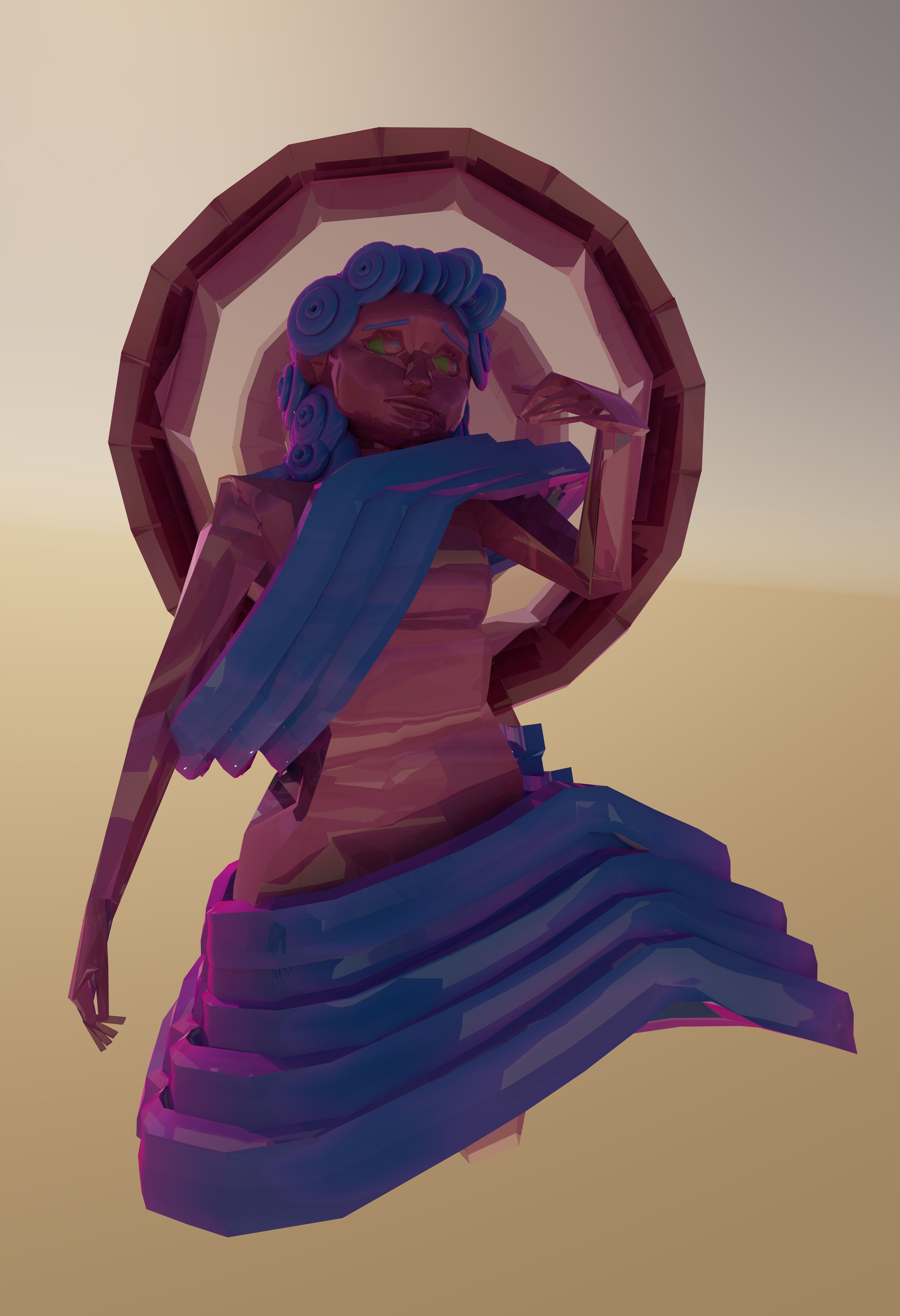
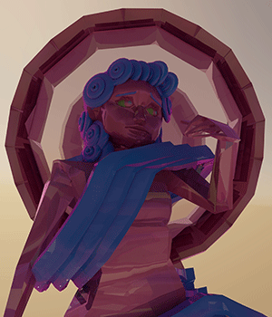
Fragile Power of it
Maya
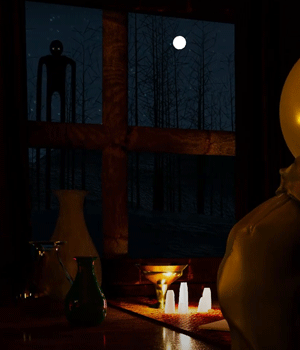
I wanted this piece to be different than my previous ones, so I took on the challenge of creating a humanoid gure in Maya without the use of sculpting. This was the very first time I had ever 3D modeled a humanoid gure, but I learned plenty about the importance of subdivisions, edge-looping, and clean typology while creating this piece. It has no name, and no real identity to speak of. This piece commentates on the fragility of things and labels. Understanding what is truly valuable versus what is not worth our time. The Fragile Power of It shows us that things are not eternal; only the idea of them remains
Nuclear Winter - 3D Animation
Maya Premiere Pro
A final 3D animation project using Maya shows the implementation of skills developed with my 3D modeling class. Although I was taught how to integrate fire simulations, I taught myself how to both rig and simulate wind chimes for a more dynamic environment. UV texturing as well as animation times had to also be considered when forming coherent scenes.
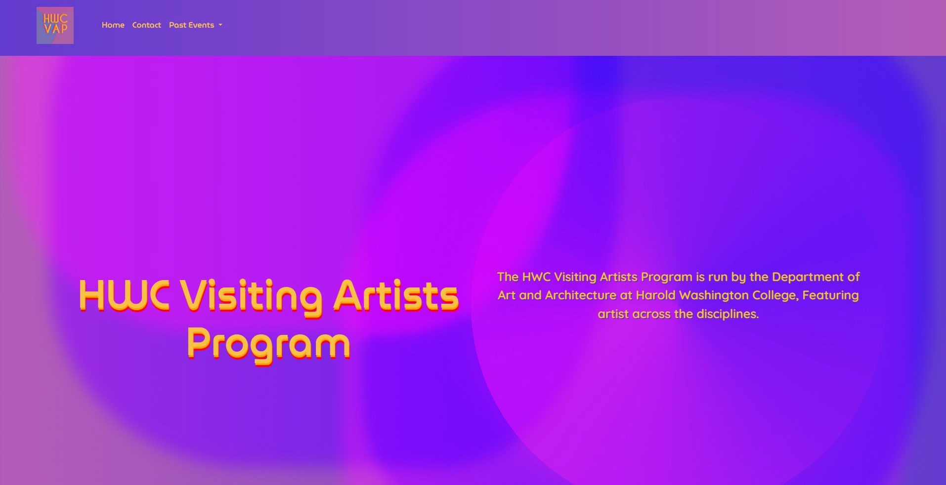
Harold Washington Visiting Artist Website
Adobe Dreamweaver BBEdit
A major project that I had been apart of required the mix of both design and technical knowledge of what could and could not be implemented without the sacrifice of both aesthetic and optimization. I developed layouts that maintained consistency, fitting the overall aesthetic of the site and what was communicated to me from both previous designers and supervisor. The HWCVAP website is designed to serve as an archive, balancing an aesthetically pleasing appeal that remains consistent with previous design concepts while being easy to navigate.